En la plataforma ATAS, el gráfico de velas se abre por defecto, pero también puede seleccionar cualquier plantilla de los 6 modos de visualización de gráficos mediante una de las opciones:
1. Haga clic con el botón izquierdo del ratón una vez en el icono de la barra de menú del gráfico y, a continuación, seleccione el modo de visualización deseado en el menú emergente.
2. Utilice el menú contextual haciendo clic con el botón derecho del ratón en el gráfico y, a continuación, seleccione el modo de visualización deseado en el menú emergente.
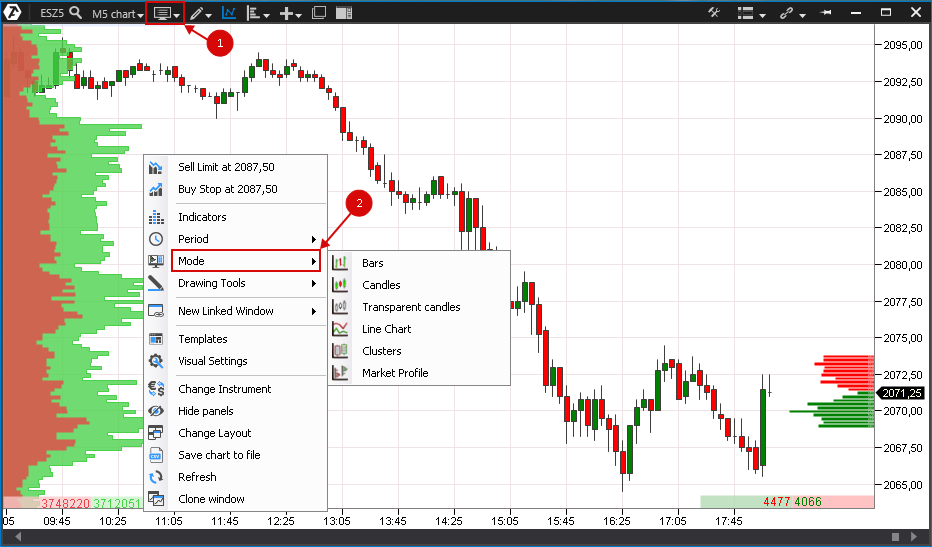
Veamos estos modos con más detalle.
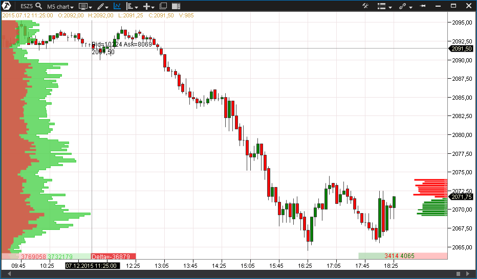
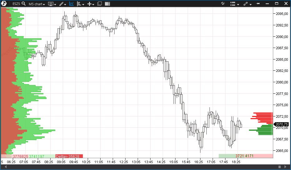
Las barras y las velas son gráficos estándar para el análisis clásico. Se basan en cuatro datos (son el cierre, la apertura, el máximo y el mínimo del rango). Las barras se diferencian de las velas sólo en el aspecto.
Bars/Barras.
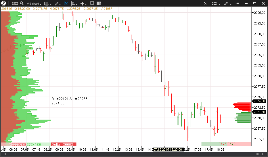
Candels/Velas
Transparent Candles/Velas transparentes
Se trata de un tipo de velas. Su peculiaridad, como su nombre indica, reside en su transparencia. A menudo, es necesario adjuntar al gráfico varios indicadores y objetos de dibujo, y para no sobrecargar el gráfico de color, se utiliza este modo de gráfico para mayor claridad.
Line Chart/Gráfico de líneas
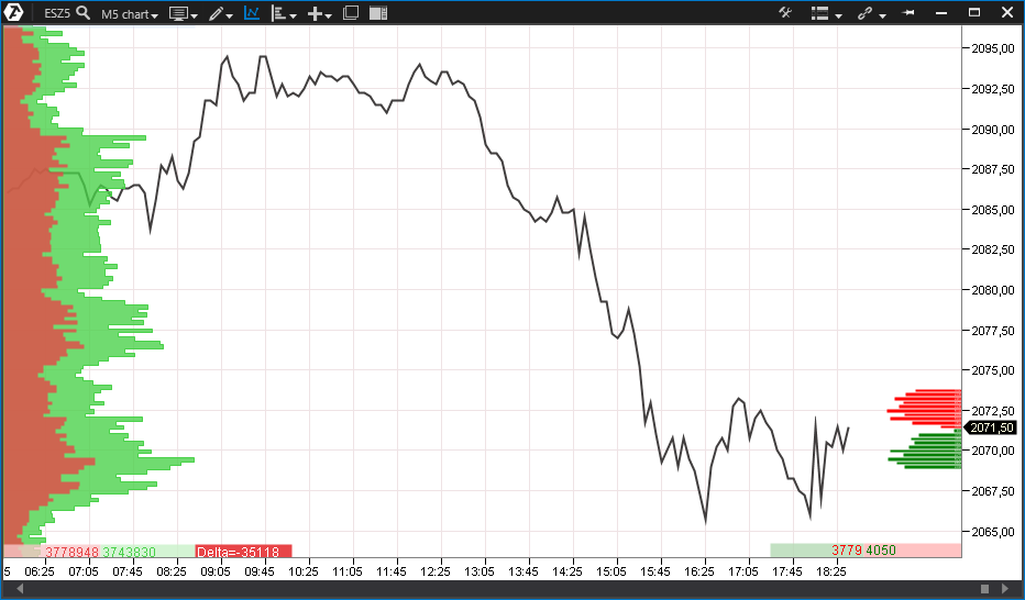
Es el gráfico más sencillo de construir y se basa en el precio de cierre de un rango seleccionado. Este tipo de gráfico tiene muy poca información; sin embargo, es conveniente para mostrar la tendencia general, especialmente durante un largo periodo de tiempo, varios meses o incluso años.
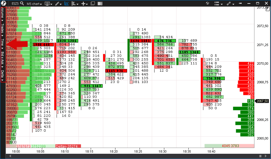
Clusters/Clústeres - son una tendencia relativamente nueva de los gráficos analíticos, en Occidente, este tipo de visualización de la información bursátil se denomina gráfico "Footprint".Los clústeres son una visualización digital o gráfica de los datos sobre las ventas y compras completas dentro de cada barra en cada nivel de precios.
Tenga en cuenta que en el modo de clústeres aparece un menú vertical adicional en la parte izquierda de la ventana del gráfico con diferentes opciones de visualización de los clústeres:
Volume - volumen.
Trades - operaciones.
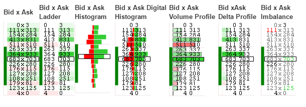
Bid x ask - compras y ventas por separado.
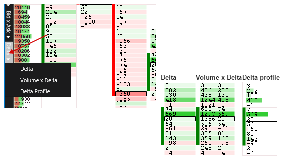
Delta - diferencia entre compras y ventas.
Veamos algunas variantes de visualización del gráfico de clústeres:
Los siguientes son ejemplos de las opciones de visualización de la configuración del gráfico de clústeres.
Volume/Volumen.
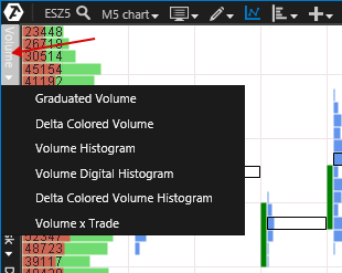
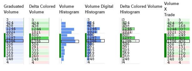
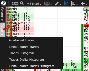
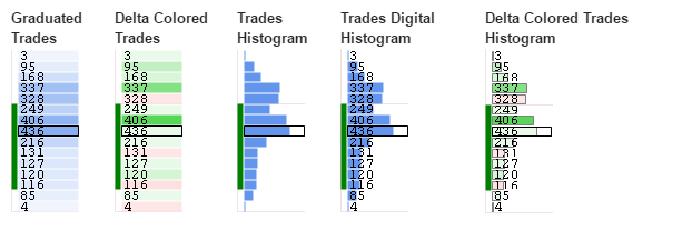
Trades/Operaciones
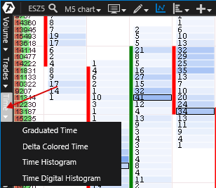
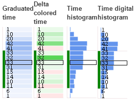
Time.
Bid/Ask.
Delta.
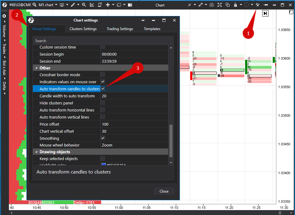
¡Tenga en cuenta! Por defecto, al reducir el zoom en un gráfico, la visualización del gráfico de clústeres cambiará a una visualización de velas y viceversa. Esto se hace por comodidad, pero si es necesario, esta opción se puede desactivar. Para ello, vaya a la configuración.
Para desactivar esta opción, debe:
1. Hacer clic en el icono de configuración.
2. En la ventana de configuración que se abre a la izquierda, seleccione la pestaña Visual Settings/Configuración visual.
3. A continuación, en Other/Resto de ajustes - desmarque la casilla en la línea Auto Transform Candles to Clusters/Convertir automáticamente velas en clústeres.
* Puede encontrar información adicional sobre los ajustes del gráfico aquí:
¿Le ha sido útil este artículo?
¡Qué bien!
Gracias por sus comentarios
¡Sentimos mucho no haber sido de ayuda!
Gracias por sus comentarios
Sus comentarios se han enviado
Agradecemos su esfuerzo e intentaremos corregir el artículo