IMPORTANT! The developer is responsible for technical support of the indicator. If you have any questions, please contact him by e-mail: bionics@gmx.de.
With this indicator you can visualize different strengths within the candles in order to identify future pullbacks within different movements.
A normal candle chart is made up of price and time. Time is a fixed factor while price is variable, for this reason a candlestick is always random. This means that there are no clear pattern sequences within the candlesticks, which means that the candlestick formations only occur randomly. A trader should always base his trading approach on high probabilities and not on coincidences. The big players are the only traders moving big markets. They work with algorithms that make it easier for them to control the individual market and limit orders. These algorithms are very complex to program because they have to ensure that the individual order types communicate with each other.
There are algorithms that search the market for certain anomalies, e.g. hidden stops, and algorithms that trigger certain trading strategies. In a breakout the big player shoots market orders into the market and at the same time withdraws the limit orders that would be holding up your own market orders. In order not to have to program new algorithms every day, the internal processes within the algorithms remain. For this, the big players in the market form invisible price zones that are simply shifted depending on the situation. This only moves the algorithms to another price level and can continue to follow their programming.
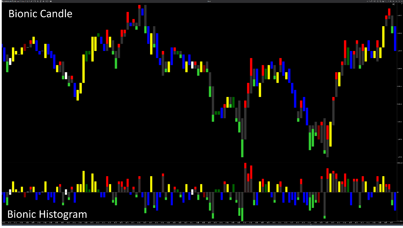
The Bionic Candle shows the candle strength more precisely than the candle charts and unclear prices are displayed better. The key point with the Bionic candle is that the last move just before the close is highlighted. For a trader, this is the last decisive move. The normal candle chart consists of a candle body with two thin wicks, from which the candle strength is derived. The wicks are often not clearly recognizable and as a result volatile price developments are shown unclearly in the chart. The bionic candle consists of nine different movement sequences, the color of which can be changed individually.
A candle chart offers four information points OHLC, but the high and low is always the same for both candles. While the close is always higher than the open in a bullish candlestick, the opposite is true for a bearish candlestick. In the past, candlestick formations have often provided traders with important information that has become more and more diluted as algorithms have been introduced. In the candle chart, the wicks are rated neutral, while the body of the candle represents strength. However, this supposed strength is wrong and is therefore often misinterpreted. The Bionic candle shows actual strength up to seven times more accurately than a candle chart.
There are only two different move processes in the Bionic candle, which saves a considerable amount of time, since 33% fewer movements have to be analyzed. Interestingly, the open is given more attention in trading than the close, even though it's further away in time. For this reason, the bionic candle does without it. The pullback from high to close in the bullish candle and from low to close in the bearish candle is a crucial point in trading. Important information can be extracted from this in order to better recognize future price developments. It is particularly interesting that certain movement sequences can be highlighted in color in a histogram. One histogram can only show the blue and yellow candles, a second histogram the dojis and a third the respective pullbacks within a candle. Important conclusions can be drawn from this.
Basically, the scale is automatically calculated based on the minimum and maximum values of the indicator, so the Bionic Candle always adapts to the chart.
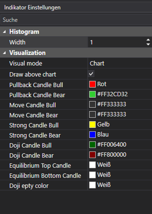
Visual Mode
The Bionic Candle can be displayed in the chart as well as in a panel. Since there are different options for color display, you can also install the indicator several times in the panel.
Draw above chart
This places the Bionic Candle behind another display in the chart. With the zoom, the values from the volume or the delta can be displayed in a kind of footprint.
Pullback Candle Bull
A bearish pullback (high to close) basically only occurs in a bullish candle and is displayed with the standard color red. It is usually the last crucial move within the bullish candle.
Pullback Candle Bear
A bullish pullback (low to close) basically only occurs in a bearish candle and is displayed with the standard color green. It is usually the last crucial move within the bearish candle.
Move Candle Bull
The bullish moving candle runs from the low to the close and is drawn in gray to draw attention to the red pullback. Another option is to draw this bullish moving candle in green.
Move Candle Bear
The bearish movement candle runs from the high to the close and is drawn in gray to draw attention to the green pullback. Another option is to draw this bearish moving candle in red.
Strong Candle Bull
The strongest bullish candle within the Bionic chart is the yellow candle. This occurs when the close occurs on the high. This also makes it easy to recognize by color when a candle is moving upwards.
Strong Candle Bear
The strongest bearish candle within the Bionic chart is the blue candle. This occurs when the close occurs on the low. This also makes it easy to recognize in color when a candle is running down sharply.
Doji Candle Bull
For the first time in the history of the stock exchange there is a bullish doji. Basically, a doji has the open and close on the same price line. A bullish doji occurs when the distance from high to close is longer than from close to low. This candle is then colored dark green.
Doji Candle Bear
For the first time in the history of the stock exchange, there is a bearish doji. Basically, a doji has the open and close on the same price line. A bearish doji occurs when the distance from low to close is longer than from close to high. This candle is then colored dark red.
Equilibrium Top Candle
For the first time in stock exchange history, there is an Equilibrium Doji. Basically, a doji has the open and close on the same price line. With the Equilibrium Doji, the distance from high to close is just as long as the distance from close to low. This color setting controls the view from close to high. Shortly after an Equilibrium Doji, stronger movement often occurs.
Equilibrium Bottom Candle
For the first time in stock market history, there is an Equilibrium Doji. Basically, a doji has the open and close on the same price line. With the Equilibrium Doji, the distance from high to close is just as long as the distance from close to low. With this color setting you control the view from close to low. Shortly after an Equilibrium Doji, stronger movement often occurs.
Doji Empty Color
Especially in the secondary trading times, it often happens that the price does not move within a candle. With this color setting, you draw a color-variable stroke.
Was this article helpful?
That’s Great!
Thank you for your feedback
Sorry! We couldn't be helpful
Thank you for your feedback
Feedback sent
We appreciate your effort and will try to fix the article